Livery Alert: Brussels Airlines’ Brighter (and Dottier) New Look


Brussels Airlines – Belgium’s flag carrier and part of the Lufthansa group – was forced to shut down operations completely during the first wave of the pandemic last year. Since reopening they’ve been gradually ramping services up again. And to keep the momentum going they recently revealed a complete livery redesign.
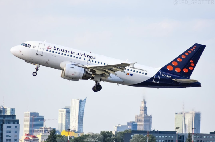
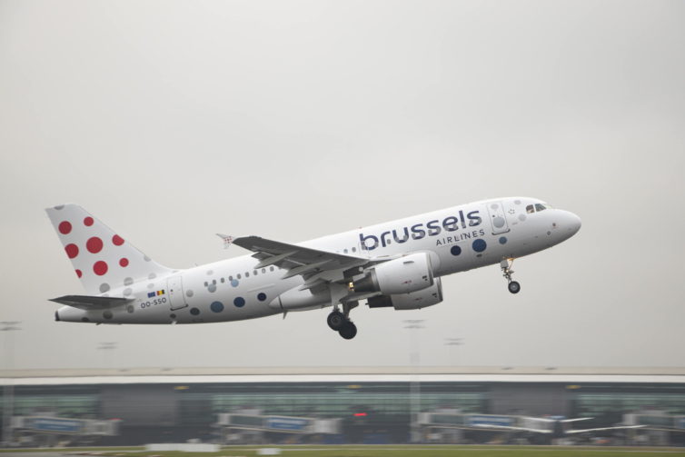
It’s a spin on the Eurowhite look that’s been increasingly popular around the world: a white background without solid colors or cheatlines on the fuselage. There’s no more dotted “B” on the tail either, but dots still make an appearance on the tail and the front of the fuselage. The nine orange dots in a 3×3 grid (the new core logo) are all different sizes, representing the diversity of the airline’s crew and customers.
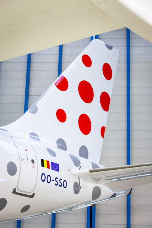
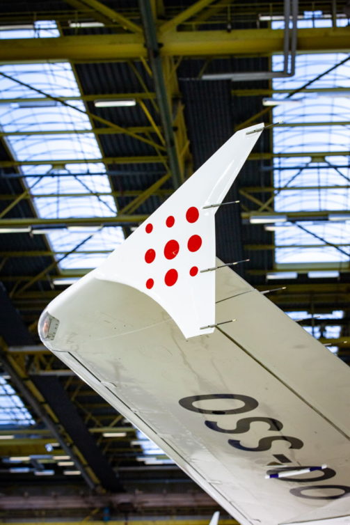
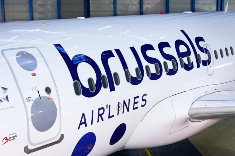
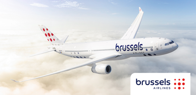
I think the colors are the strongest part of the new design. The gorgeous deep blue text goes nicely with the red on the tail. The new fonts are an improvement too. But all those dots? I think they work better on the longer A330 (see the lower-right pic above). But on the A320 they cover more of the fuselage, and the plane ends up looking like it has technicolor chicken pox. Your overall opinion of the livery likely depends on your attitude towards the Eurowhite look. But compared with the dated prior livery, it’s definitely a change for the better. Another clear win is that white paint is lighter and reflects more heat, which offers a degree of environmental benefit.
Comment below to let us know what you think of the new look, livery enthusiasts!
All images courtesy of Brussels Airlines.
The post Livery Alert: Brussels Airlines’ Brighter (and Dottier) New Look appeared first on AirlineReporter.
Did you miss our previous article…
https://softandstrongmarket.com/?p=482


